There is a quiet pleasure in opening a mailbox to find a card made by hand—a little paper handshake that says someone took time. This guide walks you through tools, techniques, and design thinking so you can make cards that feel thoughtful rather than manufactured. Whether you want to brighten a friend’s day, start a small shop, or simply slow down and craft, the processes here are approachable and adaptable.
Why handmade cards still matter

In an age of instant messages and mass-printed stationery, a handmade card stands out because it carries evidence of its maker: fingerprints, imperfect edges, deliberate choices. That evidence communicates care in a way fonts and algorithms cannot, and people notice. A card you make will be kept, photographed, and often displayed—its personal origin becomes part of its value.
Handmaking a card forces you to focus on the recipient. Choices about color, texture, and wording require thought, and that thoughtfulness translates into emotional impact. I’ve sent the same store-bought birthday card dozens of times, but the one I painted on watercolor paper for my sister is still on her mantle three years later.
There’s also the sustainable aspect. When you make a card from recycled paper, repurpose materials, or limit plastic embellishments, you create a piece that can be more environmentally friendly than many mass-market alternatives. This matters to many buyers and gives your work another meaningful angle.
Getting started: tools and materials
You don’t need a workshop full of expensive gear to begin; a few reliable basics will carry you through most projects. At minimum, stock up on a good paper trimmer, a bone folder, a craft knife, an assortment of adhesives, and a selection of cardstock in varied weights. These tools improve precision and finish, which are what make handmade cards look intentional rather than improvised.
Ink, pens, and paints are where personality emerges. Invest in a handful of archival pens for writing, a small watercolor set, and a couple of pigment or dye inks for stamping. These items are relatively inexpensive and versatile; a single color palette can be used across many styles. My favorite setup includes a waterproof black pen for outlines, a neutral gray marker for shading, and two watercolor pans for washes.
Specialty supplies are optional but rewarding: embossing powders, rubber stamps, metal dies, and a small cutting machine can expand what you can build. Start with what feels exciting and add tools as your taste evolves. Keep storage simple—clear bins and labeled envelopes save time when you have a morning to make and don’t want to hunt for a single die-cut.
Essential supplies checklist
Below is a compact list to help you gather an initial kit that will cover most card projects. This selection balances affordability with versatility so you can begin experimenting immediately.
- Cardstock (mixed weights: 80–300 lb / 200–650 gsm)
- Paper trimmer and ruler
- Bone folder or scoring tool
- Craft knife and cutting mat
- Double-sided tape and glue stick
- Archival pens, watercolor set, and pigment inks
- Basic stamp set and a small acrylic block
- Envelopes in standard sizes
These basics let you fold, adhere, write, and add simple imagery. From there you can choose one technique—lettering, painting, or stamping—to focus on and develop skill quickly.
Cardstock and paper: selecting the right foundation
Paper choice is pivotal in how a finished card feels to the hand and how it responds to media like ink and watercolor. Cardstock weight determines sturdiness, while surface finish (smooth, vellum, cold-press) affects how ink lays down and how tactile the card is. For layered designs, combine a heavy base with lighter decorative papers.
| Paper type | Weight range | Best uses |
|---|---|---|
| Light cardstock | 80–120 lb (200–325 gsm) | Envelope liners, inner panels, light printing |
| Medium cardstock | 120–200 lb (325–540 gsm) | Standard greeting cards, moderate layering |
| Heavy cardstock | 200–300+ lb (540–650+ gsm) | Sturdy bases, folded cards with added weight |
Experiment with small packs before committing to full reams. I learned that a 130 lb smooth cardstock handled stamping well, but watercolors required the tooth of a 200 lb cold-press sheet to prevent buckling. Your local craft store often sells sampler packs that save money during this trial phase.
Designing the card: concept to sketch
Good design begins with a simple question: what do you want the recipient to feel when they open this? That emotional target narrows your color palette, typography, and imagery. For instance, celebration calls for bright contrasts and playful type, while condolence benefits from muted tones and spare layout.
Start with thumbnail sketches—small, rough layouts that let you explore placement quickly without commitment. Draw three to five variations showing different hierarchies of text and image; this practice prevents overworking a single idea. Thumbnails save time and keep you open to new solutions.
Once a thumbnail feels right, make a full-scale mockup on scrap paper. Cut and tape panels to test proportions, margins, and how the card opens. This step catches awkward sizing before you commit expensive materials, and it helps you confirm how text lines wrap and where focal points land.
Color and typography choices
Color should support the message; try to limit your palette to two or three dominant hues with a neutral background. Too many competing colors make cards feel busy, while a restrained palette communicates confidence. Use color harmony—analogous colors for calm, complementary for contrast—to guide selections.
Typography is an image. When hand lettering, sketch the text separately until you find a rhythm; when using printed sentiments or stamps, choose fonts that match the mood. Pair a more decorative display font with a readable sans or serif for body text to keep balance. Legibility is always the priority—an elegant card loses impact if the message is hard to read.
Folding methods and card sizes

Understanding common folds helps you select formats that work with your concept. The standard A2 (4.25″ x 5.5″ folded) is economical and fits many envelopes, but square and gatefold designs introduce drama. Choose a fold that supports your design rather than forcing the design into a format.
Scoring before folding prevents cracking and produces a sharp edge. Use a bone folder or the dull edge of a craft tool and run it along a ruler after scoring. This small step elevates your card from homemade to hand-crafted by ensuring clean, professional folds.
- A2 (4.25″ x 5.5″) — standard, economical
- Square (5″ x 5″ or 6″ x 6″) — stands out, may require extra postage
- Gatefold — adds a reveal, good for layered scenes
- Pop-up — interactive and memorable, needs precise construction
When designing for mailing, account for postage rules and envelope sizes. Some handmade cards with embellishments need extra postage or rigid mailers, so plan logistics early if you intend to send your creations through the postal system.
Techniques you can master
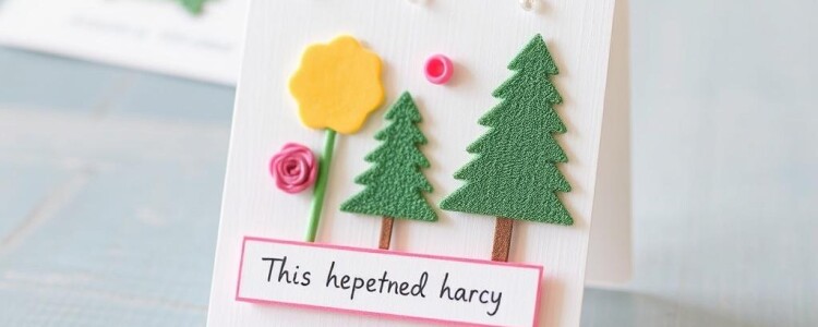
Choosing one or two techniques to master will dramatically improve your confidence and consistency. Below are several accessible methods with practical notes on how to begin and what supplies to emphasize. Each technique has its own learning curve but delivers unique aesthetic results.
Stamping and heat embossing
Stamps create repeatable motifs quickly and work well with layered ink backgrounds. Start with a few clear photopolymer stamps and a small stamp block; they’re inexpensive and simple to store. Practice pressure control to avoid uneven impressions.
Heat embossing adds a raised, glossy finish. You stamp with a sticky ink, sprinkle embossing powder, and apply heat until it melts into a sheen. Embossing gives text and outlines a tactile richness that reads as intentional detail rather than extra fuss.
Hand lettering and calligraphy
Hand lettering personalizes the message more powerfully than pre-printed text. Begin with a basic brush pen and practice strokes—downstrokes thicker, upstrokes lighter. Simple modern calligraphy techniques yield elegant results without years of formal training.
Keep a scrap sheet nearby to draft the final wording before committing to the card. A small error in spacing or letterform can disrupt the whole composition, so practice and planning are essential. I often write the sentiment twice, keeping the best attempt for the inside and covering mistakes with a contrasting paper band.
Watercolor and painting
Watercolor creates soft, atmospheric backdrops and delicate florals. Use watercolor paper with enough thickness to resist warping, and work in layers—light to dark. Let each wash dry fully before adding detail to maintain clarity in the image.
Limited palettes work best for cards; pick three colors that mix well to avoid muddying. If you’re new to watercolor, practice blending a single motif like a leaf or circle until you can control pigment flow and edges. Those small controlled marks are surprisingly effective on cards.
Collage, layering, and mixed media
Collage invites texture and depth through layered papers, fabric scraps, and found ephemera. When piecing elements together, consider scale and negative space—the eye needs places to rest. Keep the focal point crisp and let surrounding layers support it without fighting for attention.
Adhesive choice matters: liquid glue can wrinkle thin papers, while double-sided tape offers a flat, secure bond. For heavier elements like buttons or small charms, use a strong tack or a fabric glue that won’t release during mailing. I’ve learned the hard way that a loosely glued sequin can become litter in the mailbox.
Personalization ideas that feel authentic
Personalization is more than inserting a name; it’s an opportunity to reference shared moments, inside jokes, or sensory memories. A subtle allusion—a map snippet of a favorite neighborhood, a tiny watercolor of a pet’s distinguishing feature—makes a card feel crafted for that person alone.
Use photographs sparingly and thoughtfully. A small photo panel can be beautifully integrated into a layout when cropped and framed with a mat, whereas a full-size photo printed without consideration can overwhelm the handcrafted elements. For privacy, consider printing images on translucent vellum to soften them.
Handwritten notes outvalue long printed messages. Even a single honest sentence, placed carefully, will be remembered. I keep a notebook of short, specific compliments or memories to borrow from when writing cards; it saves time and avoids the trap of cliched phrases.
Interactive elements and surprises
Adding pockets, pull tabs, or small inserts turns a card into an experience. Pockets are simple: glue three sides of a small piece of paper to create a slot for a tag or a tiny photo. Pull tabs require sliding channels but can be very rewarding when done cleanly.
Interactive features increase perceived value and make the card memorable. Keep durability in mind—moving parts should be robust enough to survive handling and postage. Test the mechanism a few times, and reinforce stress points with thin strips of cardstock when needed.
Step-by-step projects to practice

Practical projects help cement technique. The three below are designed to teach fundamental skills and produce attractive results with reasonable effort. Each includes a materials list and clear steps so you can complete a finished card in an afternoon.
Project 1: Simple watercolor floral birthday card
Materials: 140 lb cold-press watercolor paper, small watercolor set, waterproof pen, 130 lb cardstock base, glue tape, envelope. This project emphasizes washes and economy—only a few shapes and a controlled palette are necessary.
- Cut watercolor paper to 4″ x 5.25″.
- Sketch three floral shapes lightly in pencil.
- Lay a light wash across each shape, let dry, and add a darker stroke for petals.
- Outline sparingly with a waterproof pen for contrast.
- Mount onto a folded A2 base with double-sided tape and write a short sentiment inside.
The goal is not botanical accuracy but suggestion. With a restrained palette and a few confident strokes, you achieve a card that reads delicate and intentional. Practice three panels before assembling the final card to get comfortable with water control.
Project 2: Clean stamped greeting with embossed sentiment
Materials: heavy cardstock base, clear stamp set, pigment ink pad, embossing powder, embossing heat tool, small foam tape squares. This project teaches crisp stamping and the shine of embossing.
- Center a motif stamp on the front of the card and ink it with pigment ink.
- Sprinkle embossing powder immediately and tap off excess.
- Heat the powder until it melts and becomes glossy.
- Mount a small stamped panel onto the card using foam squares for dimension.
- Add a contrasting inked edge or a thin ribbon as a finishing touch.
Embossing elevates even simple designs into something refined, and foam mounting introduces shadow and depth. If you sell cards, this method creates a perceived luxury that buyers respond to without much extra material cost.
Project 3: Collage keepsake for a milestone
Materials: mix of patterned papers, glue stick, heavy cardstock base, small printed photo, metallic pen. This project is ideal for anniversaries or graduations and practices composition and scale.
- Create a background panel by layering torn strips of patterned paper horizontally.
- Mat a small photo on a neutral piece and position it off-center.
- Add a hand-lettered date or short word in metallic pen near the photo.
- Mount the completed collage onto the card base with strong adhesive.
- Write a personal message inside that refers to the photo or memory.
Collage allows you to reuse interesting scraps and create texture without heavy technique. It’s forgiving and expressive, and recipients love the sense that the piece was assembled from meaningful fragments.
Finishing touches, packaging, and mailing
Finishing touches make the difference between a project and a product. Trim edges cleanly, remove pencil marks, and press the card under a weight for a day if layers tend to lift. Add a small sticker or label on the back with your name or brand for a professional finish.
Packaging protects and presents your work. Clear cello sleeves keep cards safe in displays and during shipping, and a small band or belly-wrap with your logo looks intentional. If gifting, a tissue-wrapped card in a kraft envelope feels special and opens slowly, building anticipation.
When mailing, consider thickness and embellishments. Heavier cards or those with glued-on items may require additional postage or rigid mailers to prevent crushing. Test a sample in an envelope by dropping it at the post office—staff can often advise on postage and handling options.
Pricing, selling, and sharing your cards
If you plan to sell, price with both material cost and time in mind. A common method is cost-plus: calculate materials and add an hourly rate for construction. Research local market prices and factor in fees for online platforms or booth rental at markets.
Photography and presentation are major sales drivers. Invest time in styling clean product photos—good natural light, neutral backgrounds, and lifestyle shots that show the card in use. A compelling image communicates quality and helps buyers imagine giving the card to someone they love.
Start small with local craft fairs, consignment in boutiques, or an Etsy shop. I sold my first batch of cards at a neighborhood fair and used that feedback to refine sizing and packaging. Direct customer conversations revealed preferences that no online metrics could capture.
Care, storage, and sustainability
Proper storage preserves pieces and prevents color fading and warping. Keep cards flat in acid-free envelopes or boxes, away from direct sunlight and extreme humidity. For long-term storage of inks and paints, cap them tightly and store them upright to avoid clogs or spills.
Sustainability grows in importance for buyers. Use recycled papers, avoid plastic where possible, and disclose materials honestly. Small changes—like compostable cello sleeves or recycled envelopes—signal that you care about impact without compromising aesthetics.
Repurposing scraps and testing eco-friendly adhesives lets you reduce waste. I keep a small drawer for leftover papers and find that many winning designs originated from a single interesting scrap rescued from the reject pile.
Resources to learn and grow
Workshops, community classes, and online tutorials accelerate learning. Local community centers often offer short weekend classes in calligraphy or papercraft, which are excellent for hands-on guidance and immediate feedback. Online, you’ll find videos that break down techniques into digestible steps you can pause and replay.
Books and zines focused on handcrafting offer deeper insights into composition and technique. Follow a few makers on social platforms whose aesthetic you admire and observe the details they emphasize—paper selection, margins, or finishing touches—and then adapt those lessons to your voice.
Practice deliberately. Set a small weekly goal—one card finished each Saturday morning—and use it as a laboratory. Over time you’ll build a body of work, find signature techniques, and gain the confidence to take more creative risks.
Continuing to experiment and find your voice
As with any craft, progress comes from consistent, purposeful practice and the willingness to fail often and learn quickly. Try designing a set of five cards that share a motif or palette to explore variations without starting from scratch each time. Variation trains your eye and saves time in production.
Seek feedback from friends, customers, or fellow makers. A small critique group can point out composition problems you’ve stopped seeing and offer ideas you might not have considered. Good feedback is specific and actionable; use it to refine, not to second-guess your instincts.
Keep a record of ideas—sketchbook pages, photos, and notes on what worked. Years from now those pages will be a resource and a reminder of how your work evolved. Above all, let the act of making be itself a reward; meaningful cards begin with a maker who enjoys the process.
With a few tools, thoughtful choices, and regular practice, you can create personalized handmade greeting cards that move people. Start small, focus on intention, and let each project teach you something new about materials and about who you are as a maker. Then send the card—postmarked and real—and watch a small, handmade gesture work its quiet magic.